This week in Interior design we've been learning about learning about housing styles. Its important to knowing styles because when your looking for a home to live in, you can tell when
the house was build because of the style.

Saltbox- An early North American house style. Normally the front of the house is faced south to capture the suns warmth. The back of the house has few windows and low slopping roof. The saltbox house was originated Texas and build in 1852.

Garrison- An colonial time Styled house. Known for its second story overhanging the first story, usually over the front of the house. This house usually has narrow wooden clapboard siding and trim and decorative details are minimal. Garrison were originated in 1707 and are still popular today.

Georgian (Colonial style)- Named for the King Georges of England, were build before. These houses have classic-inspired details around the main door, that is, Classic columns or pilasters and a round arch, as in the picture. The roofs are often pitched, from which rise several chimneys serving fireplaces inside. Georgian houses when they were first being built were made out of wood, now there more of brick.

Federal style- These house style were built immediately after the American Revolution. Like Georgian houses (description above) these houses have many Classic details, such as Palladian windows, columns, or pilasters. Their low pitched roofs often disappear behind a balustrade, as in the picture shows.

Classic-Revival Style (Greek revival)- This style is most often copied for a modern "colonial" house. These houses can be recognized when seeing columns, pillars two stories high, porches. This house was popular were america was obsessing over Greek styled things. This home is described as impressive or formal.

Cape Cod house- This style of house first appeared in the early years of North Americas history. It has a steeply pitched roof, with or without dormers. Originally sided with natural wood shingles, today its more often built with wooded clapboard siding. The cape cod house is style a popular style today.

Gothic-Revival Style- This style was popular in the middle of the nineteenth century, but is not now. The house borrowed decorative details from medieval Gothic cathedrals, like that shown in the picture. These details included pointed arches, high-pitched roofs, elaborate decorative trim, and sometimes even towers. Gothic Revival houses are hard find.

Row houses and town houses- As cities grew in the middle of the last century, row houses begin lining the streets. These houses were built on narrow, long properties, so they had narrow fronts with several stories above. The walls of on row houses were set against the next, all in a row, sometimes resembling one another in appearance. Today these homes are called townhouses.

Italian Villa- in the middle of the nineteenth century some people built large houses resembling Italian villas. They could assume many forms, but they all used Classic columns or pilasters, and round arches and pediments over doors and windows. Quoins run up different parts of the house.

Stick Style-The industrial Revolution and the invention of the jigsaw inspired many builders to make intricate and individualistic wood decorations for houses at the end of the last century. Historians have called this the stick style. You can identify it by its decorative woodwork, especially for porches, around doors and windows , and brackets.

Art Nouveau- Is more a decorative style than a basic house shape. Human faces wearing fanciful headdresses, plants, and flowers are all typical of Art Nouveau motifs. Art Nouveau decoration can be molded in stucco or cement and worked in color in stained-glass windows, all made at the turn of the century.

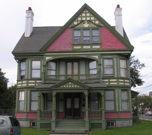
Queen Anne Cottage- This turn-of-the-century style came from England. Though large, its low arches, deep porch, and dark dies, often of shingles, stone, or brick, give it the cozy, warm feeling ofa cottage.

Tudor style- Tudor is a name applied to several fifteenth and sixteenth-century English styles. Because of its traditional appearance, it has remained particularity popular in North America, even today.

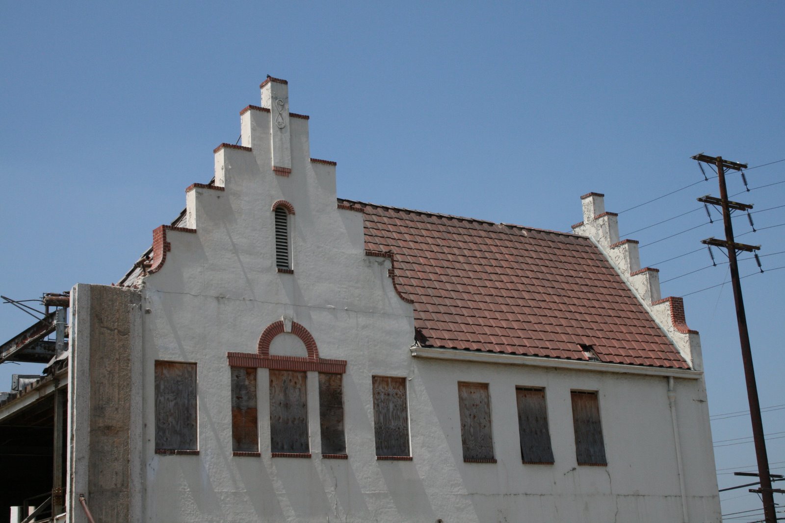
Dutch Style- You'll occasionally find a house that has a roof with a stepped, rather than triangular, gable. Showed in the picture is such a gable and a typical Dutch-style house. This roof and first appeared in Holland and other countries of the Lowlands of Europe.
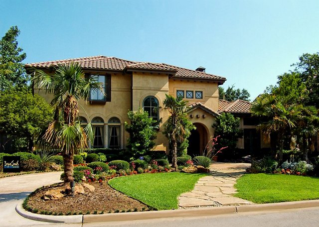
This house, made of poured cement or stucco, with details in wood, is found mainly in the Western United States, where Spanish influence affected early history. The style has no set features. Instead, a general Spanish fashion characterizes it.

Prairie- This house was designed by Frank Lloyd Wright. The name Prairie comes in part because he designed houses in Midwestern America. He gave these houses long, low lines, with open balconies and spreads of windows, all reflecting the flat, open environment of the prairie. The style greatly influenced modern housing styles in North America.

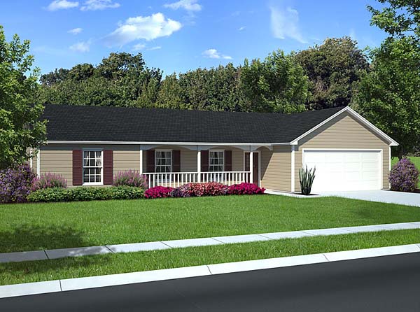
Ranch- The popular ranch house style was inspired by Wrights Prairie House Designs (previous house). Like a prairie house, it is ling and low, usually of only one floor. The illustrated example is small, yet some ranch houses spread out in a rambling design to include many rooms. The building material, interior plan, and design details vary greatly from house to house.

International- This style is a distinctly twentieth-century creation. The international style looks like cubs or boxes grouped together in an ground; sometimes is is raided on columns with a gargle beneath. Roofs be flat or with a single slope. Any materials can be used, but seldom in a traditional way.
Split level- These houses are twentieth-century in which the first floor lies on more than one level, so you must step down or up in passing form one room to another. On a level property, the split-level accommodates a cellar beneath on section of the house.

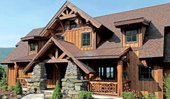
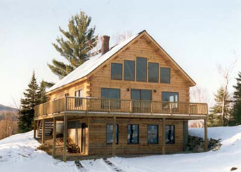
Rustic Style- Might be described a a feeling rather than distinct design. Such a house gives the feeling of woods, lakes, and outdoors. Its to be expected in such a rural environment as a vacation home or in a wooded suburb.
Chalet or Alpine Style- A chalet is a Swiss mountain cottage with overhanging caves. The term Alpine has come to describe any of the traditional building styles of the Swiss and Austrian Alps. You can expect to find variations when Alpine styles are coped for houses in the mountains or lake regions of North America.
A-Frame- In the 1950s a new house style began appearing in the vacation areas of North America, the the A-frame. Covered framing members, propped in the shape of the letter A, serve as both the roof and the side walls of the building. Over the years some A-frames have become more elaborate, featuring the balconies of a Swiss Chalet, the rambling wings of a ranch house, or other modifications.
 A-Frame- In the 1950s a new house style began appearing in the vacation areas of North America, the the A-frame. Covered framing members, propped in the shape of the letter A, serve as both the roof and the side walls of the building. Over the years some A-frames have become more elaborate, featuring the balconies of a Swiss Chalet, the rambling wings of a ranch house, or other modifications.
 Dome- Geodesic domes are unique twentieth-century structures. There made of very light yet extremely strong triangular panels, arranged in the shad of a hemisphere. In the 1950s such domes were widely used for military and industrial purposes.
 Earth-Sheltered house- These structures trace their roots back to the first human dwellings-caves. Sometimes called underground houses, they are most often banked with soil at the back and sides. The roof may be covered with a layer of earth, too. They most often have a low, long, narrow shape. Their design is simple and practical.
 Manufactured- These houses are built entirely or party at a factory. They are then transported by truck to the actual building sites. Some manufactured houses are delivered in sections or modules that must be assembled. Others as mobile homes, arrive at their destinations nearly read for occupancy.
 Mobile- A factory built dwelling delivered to its site by truck. The mobile home may be situated on a private lot that belongs to its owner, or in a mobile-home park shared with a number of other mobile homes.
 Duplex- Combines two housing units in one building. the two units may be next ti teach other or on separate stories. A duplex may also be called a double house, a double-Decker, a twin, or a two-family house. A duplex house occupies less land and it is cheaper to build than two separate houses.